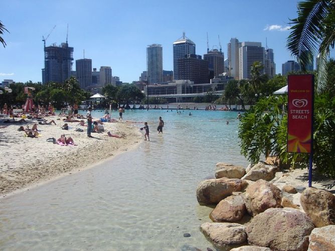
Future Sydney? Climate projections show Sydney’s climate could end up more like Brisbane’s. Image: Kevin Gibbons/Flickr, CC BY
Australia is on track for up to 1.7C of warming this century if the world curbs its greenhouse emissions, but under a worst-case scenario could see anything from 2.8C to 5.1C of warming by 2090, according to new climate change projections released by the CSIRO and the Bureau of Meteorology.
The projections are the most comprehensive ever released for Australia. They are similar to those published in 2007, but based on stronger evidence, with more regional detail. These projections have been undertaken primarily to inform the natural resources management sector, although the information will be useful for planning and managing the impacts of climate change in other sectors.
Possible futures
The new report draws on climate model data used by the Intergovernmental Panel on Climate Change (the IPCC). The Fifth IPCC Assessment Report (AR5), released in 2013 and 2014, used a range various greenhouse gas and aerosol scenarios to project future climate change.
Over the past 10 years, carbon dioxide emissions have been tracking the highest IPCC emission scenario (known as RCP8.5). If there is limited international action to reduce emissions, then projections based on the highest scenario may be realised.
However, if emissions are significantly reduced over the coming decades, then intermediate emissions (RCP4.5) might be feasible. Following the low emissions scenario (RCP2.6) would be very challenging given the current trajectory of carbon dioxide emissions.
How does Australia compare?
By late in this century (2090), Australia’s average warming is projected to be 0.6 to 1.7C for a low emission scenario, or 2.8 to 5.1C under a high emission scenario.
The warming under the high scenario is similar to the global average warming of 2.6 to 4.8C under the high emission scenario reported by the IPCC AR5. However, inland areas of Australia will warm faster than coastal areas.
For example, the Rangelands of inland Australia warm by 2.9-5.3C by 2090 under high emissions, while the East Coast, including Sydney and Brisbane, warms by 2.7-4.7C.
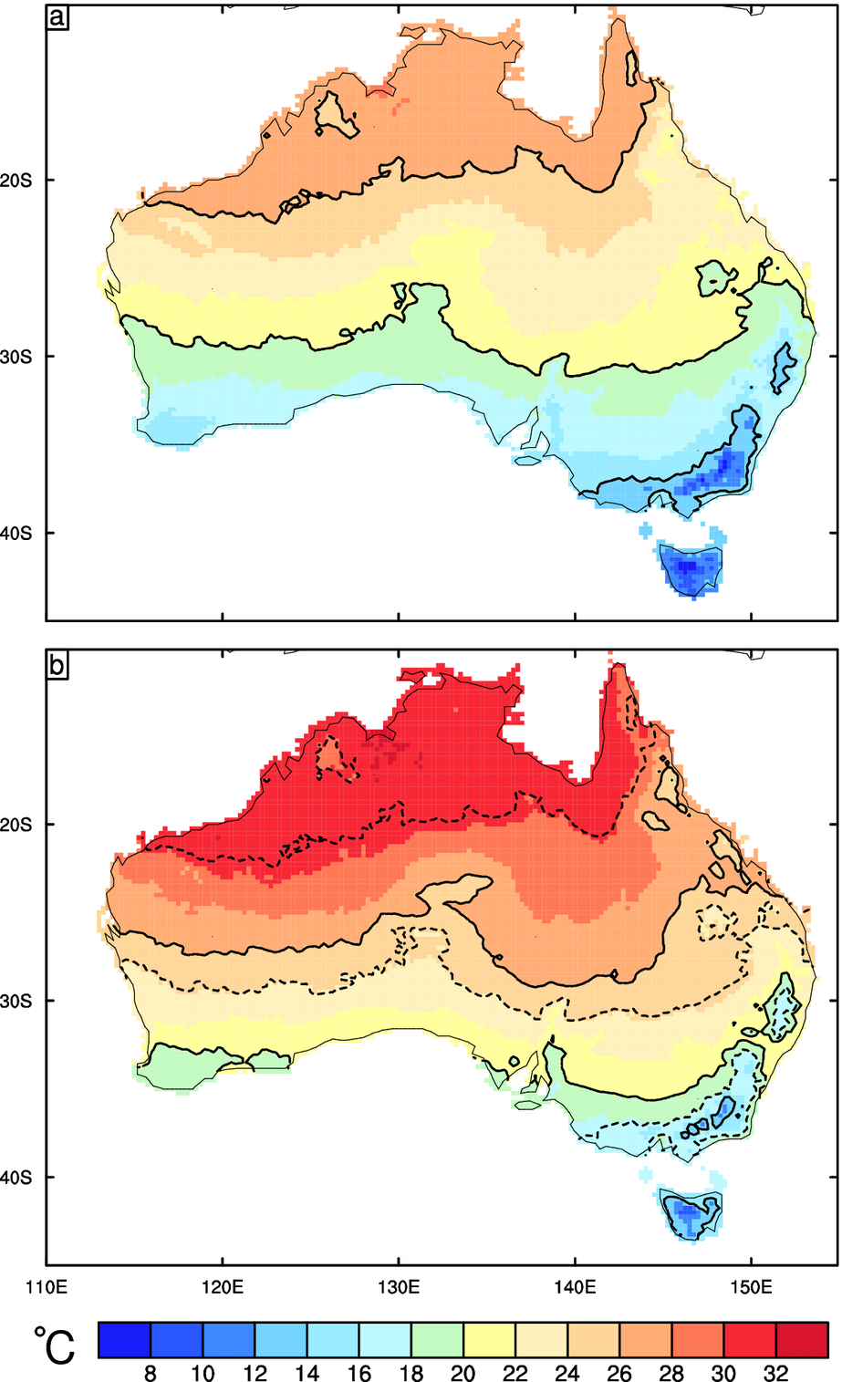
This map shows the annual mean temperature for present climate (A), and late 21st century (B). In each panel the 14C, 20C, and 26C contours are shown with solid black lines. In (B) the same contours from the original climate are plotted as dotted lines to provide the clearest depiction of the shifts in climate.
Historical context
The new projections should be viewed in the context of what has already been observed. Australia has become 0.9C warmer since 1910. Rainfall has increased in northern Australia since the 1970s and decreased in south-east and south-west Australia.
More of Australia’s rain has come from heavy falls and there has been more extreme fire weather in southern and eastern Australia since the 1970s. Sea levels have risen by approximately 20 cm since 1900.
In future, Australia’s average temperature will increase and we will experience more heat extremes and fewer cold extremes. Winter and spring rainfall in southern Australia is projected to decline while changes in other regions are uncertain.
For the rest of Australia, natural climate variability will predominate over rainfall trends caused by increasing greenhouse gases until 2030. By 2090, a winter rainfall decrease is expected in eastern Australia, but a winter rainfall increase is expected in Tasmania.
Historical climate data can be used as an analogue for the future. The analogue could be a location that currently has a climate similar to that expected in another region in the future.
For example, for a warming of 1.5-3.0C and a rainfall decrease of 5-15%, Melbourne’s climate becomes similar to that of Clare in South Australia, Sydney becomes more like Brisbane, and Brisbane becomes more like Bundaberg in inland Queensland.
Extreme rainfall events that lead to flooding are likely to become more intense. The number of tropical cyclones is projected to decrease but they may be more intense and possibly reach further south. Southern and eastern Australia is projected to experience harsher fire weather. The time in drought will increase over southern Australia, with a greater frequency of severe droughts.
A projected increase in evaporation rates will contribute to a reduction in soil moisture across Australia. There will be a decrease in snowfall, an increase in snowmelt, and therefore reduced snow cover.
Sea levels will continue to rise throughout the 21st century and beyond. Oceans around Australia will warm and become more acidic.
What will Australia look like?
Freshwater resources are projected to decline in far south-west and far south-east mainland Australia. Rising sea levels and increasing heavy rainfall are projected to increase erosion and inundation, with consequent damage to many low-lying ecosystems, infrastructure and housing.
Increasing heat waves will increase risks to human health. Rainfall changes and rising temperatures will shift agricultural production zones. Many native species will suffer from reduced habitats and some may face local or even global extinction.
The most vulnerable regions/sectors are coral reefs, increased frequency and intensity of flood damage to infrastructure and settlements, and increasing risks to coastal infrastructure and low-lying ecosystems.
While reductions in global greenhouse gas emissions would increase the chance of slowing climate change, adaptation is also required because some warming and associated climate changes are unavoidable.
![]()
This article was originally published on The Conversation. Read the original article.

4th February 2015 at 12:25 pm
With about 60 previous years of the worlds heaviest greenhouse pollution still traveling to build a thicker greenhouse insulation around the planet, we need to start addressing the likely impacts.
It would be great to get projections on the increase in ocean acidity, as it appears it will be the catastrophic start of the collapse of the natural environmental support systems sustaining human life.
My non science background impression of the data indicates a possible 15 to 25 year time frame till the increasing ocean acidity stops the formation of marine animals backbones, shells and corals, where upon this collapse of the ocean as a major food source will create political chaos globally, with post ocean collapse increasing temperatures and altered rainfall increasingly compromising agricultural capacity to feed the world, and leading to increased sea level heights globally inundating coastal settlement and infrastructure, i.e the relatively immanent collapse of the oceans may be the indicator of the start of a climate system that politically and environmentally has escalated out of our control.
3rd February 2015 at 6:51 pm
Love ur calls Jewels. I think u’re ALMOST spot on, don’t forget though of the greater use of renewables ceramic fuel cells, wind & water! All for that ‘utopia’. Doing my best to create as much of it throughout my living style & house facilities etc too!! Let’s get there & help kick the bloke w some wacko case against Science out!
3rd February 2015 at 5:21 pm
I agree with Graham Lovell that the tone of these articles is more along the lines of political advocacy than objective analysis of actual measurements and an unbiased presentation of the degree of uncertainty that lies at the heart of the projections of any climate model (all 40 of them!). The email introduction to this news item states “The projections are the most comprehensive ever released for Australia. They are similar to those published in 2007, but based on stronger evidence, with more regional detail.” Maybe so, but the article cannot correctly state what has actually happened to rainfall in southern and southeast Australia from 1910 to 2014. The BOM’s own website shows that in southeast Australia, the linear trend in rainfall is +0.3 mm per decade – essentially no long term trend and certainly not a decrease as claimed in the article. Furthermore, the linear trend in rainfall for the Murray Darling Basin is +4.23 mm/decade and for Southern Australia is +3.33 mm/decade (these are the BoM’s own regions). One can also look at 7, 9, 10 and 11 year moving averages for rainfall on the website and one finds that there are peaks and troughs in an interannually variable record of rainfall. Proponents of catastrophic climate change such as Professor Tim Flannery use the rainfall in the 1970s to show that the present day rainfall has decreased considerably, but the BoM data shows that the 1970s were one of the wettest periods on average during the last 114 years for Southeast and Southern Australia and the MDB. It all depends on where one chooses the start time in making these comparisons, and those who want to make the point that rainfall is decreasing obviously choose the best starting point for their comparisons.
The climate modellers continue to have difficulty in predicting trends in rainfall at a regional level, which suggests that they have not included all the variable inputs correctly nor properly parameterized the complex interdependent equations that are producing the final model output. One would expect that they will work hard to overcome these problems in a completely objective way so that future projections can be more reliable, and uninfluenced by the political advocacy of the day. This will make the task of planners, land managers and farmers in adapting to climate change much easier.
28th January 2015 at 4:05 pm
Reblogged this on FAIRNEY VIEW e-scape and commented:
my brain-wave was Tory Tony getting kicked out, replaced by Malcolm Turnbull and a bi-partisan agreement to create a solar – geo thermal – beautiful Utopia…I want the best of all possible worlds for my grandchildren.
28th January 2015 at 9:38 am
In 1990 the forecast for CO2 atmospheric levels for CO2 in 2010 were 397 ppm on scenario A (no reductions), but actuals were 390 ppm. That is not evidence for CO2 emissions tracking the no-action scenario, as claimed in this article.
What were your emissions forecasts for CO2 over the last 10 years, and what have been the actuals?
What percentage of anthopogenic emissions of CO2 historically have found themselves in the atmosphere, and what are you assuming?
Do you really think that China will continue to ramp up its emissions as it has done over the last 15 years? If not, IMO your projections based on RCP8.5 are on shaky grounds, and should not have been the base point of the article. Rather the impact of likely emission levels should have been the focus, with (unlikely) extremes a side comment.
28th January 2015 at 4:24 pm
Hi Graham
We forwarded your question onto the team responsible for the report, who have provided the following:
“Actual emissions over the past 10 years have been tracking along the RCP8.5 curve. This is the high emissions scenario, with little curbing of emissions, as used by the IPCC and in the Australian projections. This is presented in Peters et al, http://www.nature.com/nclimate/journal/v3/n1/full/nclimate1783.html (See Figure 1).
Regarding the percentage of anthropogenic emissions of CO2 in the atmosphere, radiative forcing by emissions and drivers are described in Figure 3.1 of the Technical Report (http://www.climatechangeinaustralia.gov.au/media/ccia/2.1.4/cms_page_media/168/CHPT%203.pdf). 100% of greenhouse gases pass through the atmosphere, whether they are anthropogenic or from other sources (e.g. Volcanic eruptions). About 50% of the emissions are taken up by terrestrial and oceanic sinks, leaving about 50% in the air which can be measured as a CO2 concentration.
Finally, projections are presented as a range dependent on emissions scenario. This is a conscious effort to represent uncertainty of future emissions trajectories. The reports include projections for four emissions scenarios; low, intermediate and high. There is no mention of China’s future emissions in the article.”
Thanks
Nick
CSIRO Social media team
28th January 2015 at 8:37 pm
Dear Nicholas
IMO, RCP 8.5 is not a likely scenario. Despite this, it is the basis for the predictions in this article and the Cai article upon which it is substantially based. Time will tell whether the 2020 actuals are close to the 12 for RCP 8.5 on the Peters’ chart. If it is not a likely scenario, then using RCP 8.5 as the basis for the main thrust of this article has to be considered to be questionable.
Nevertheless, thanks for the link to the Peters’ article. It is noted in this article that the RCP 8.5 only emerged in 2007, and includes a reset in emissions estimates. Actual emissions have been falling below the previous (worse-case) estimates – such as the 1990 estimates and the SRES estimates. Indeed, the “RCP 8.5” estimate hardly provides a solid base for claims about emission trajectories over the last 10 years – the RCP cases have only been going for 7 years!
My point on China is that you cannot forecast future emissions without considering China, which is the #1 world’s emitter, and the source of most of the increases in emissions. RCP 8.5 depends on China continuing to increase its emissions, which is unlikely, or some other nation (e.g. India) taking China’s place, which is also unlikely – it would be hard to reproduce China’s inefficiency in using coal. The Peters’ article mentions China (once), but makes no reference to its likely emissions path. Surely a prediction of the future that does not deal with the real world, as in Peter’s article, vitiates the conclusions of that article. One can only say that this puts in question the objectivity of the conclusions reached in the Peters’ article, giving the impression that it has drifted into political advocacy.
Kind regards
Graham