There is no shortage of data and information in the world. But how can we access it easily and how can it be presented in a way people can understand?
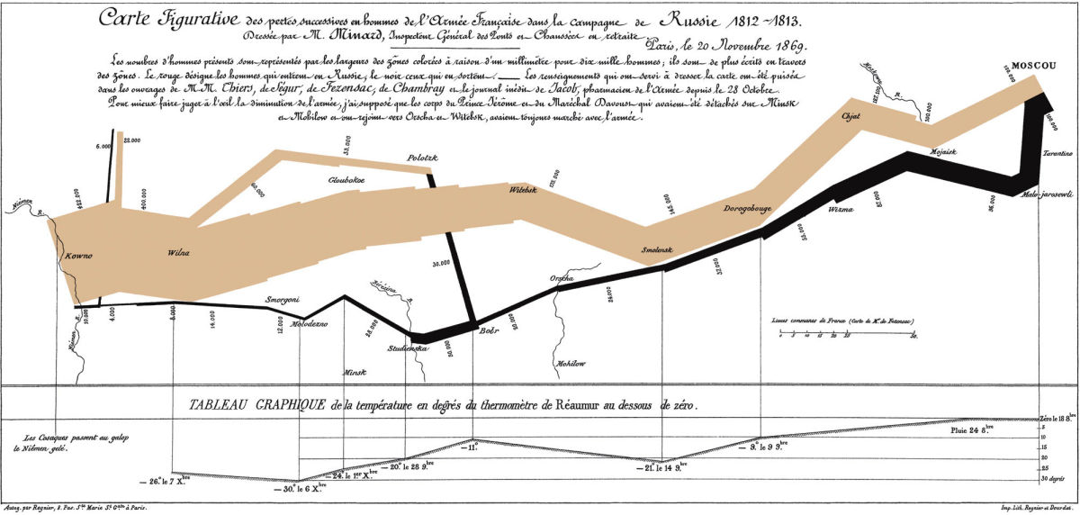
Take this example below. It has been described as the “best statistical graphic ever drawn”.
Charles Minard’s 1861 map of Napoleon’s ill-fated march on Moscow in 1812-1813.
Full size HERE
 “Of all the attempts to convey the futility of Napoleon’s attempt to invade Russia and the utter destruction of his Grande Armee in the last months of 1812, no written work or painting presents such a compelling picture as does Minard’s graphic.”
Now consider the task ahead for the Australian Square Kilometre Array Pathfinder radio telescope being built in Western Australia. The ASKAP will hopefully be the forerunner of Square Kilometre Array telescope which Australia is bidding to host.
Australia and New Zealand SKA director (and a former Scottish junior Scrabble champion) Professor Brian Boyle put it this way:
“The SKA will generate five million million bytes of information in its first day…there’s actually seven million million grains of sand on the world’s beaches, so in one day the SKA will generate as much information as grains of sand on the beach…or in one hour if you recorded all the data that the SKA produced to a CD and then stacked all those CDS up it would be one kilometre high,” he said.
“The supercomputer will process the data in real-time and has been ranked as one of the top 100 super computers on the planet, we’re looking at storage in the region of 30 or 40 petabytes (30,000-40,000 terabytes).”
Helping to work out how to deal with so much data is the CSIRO ICT centre.

