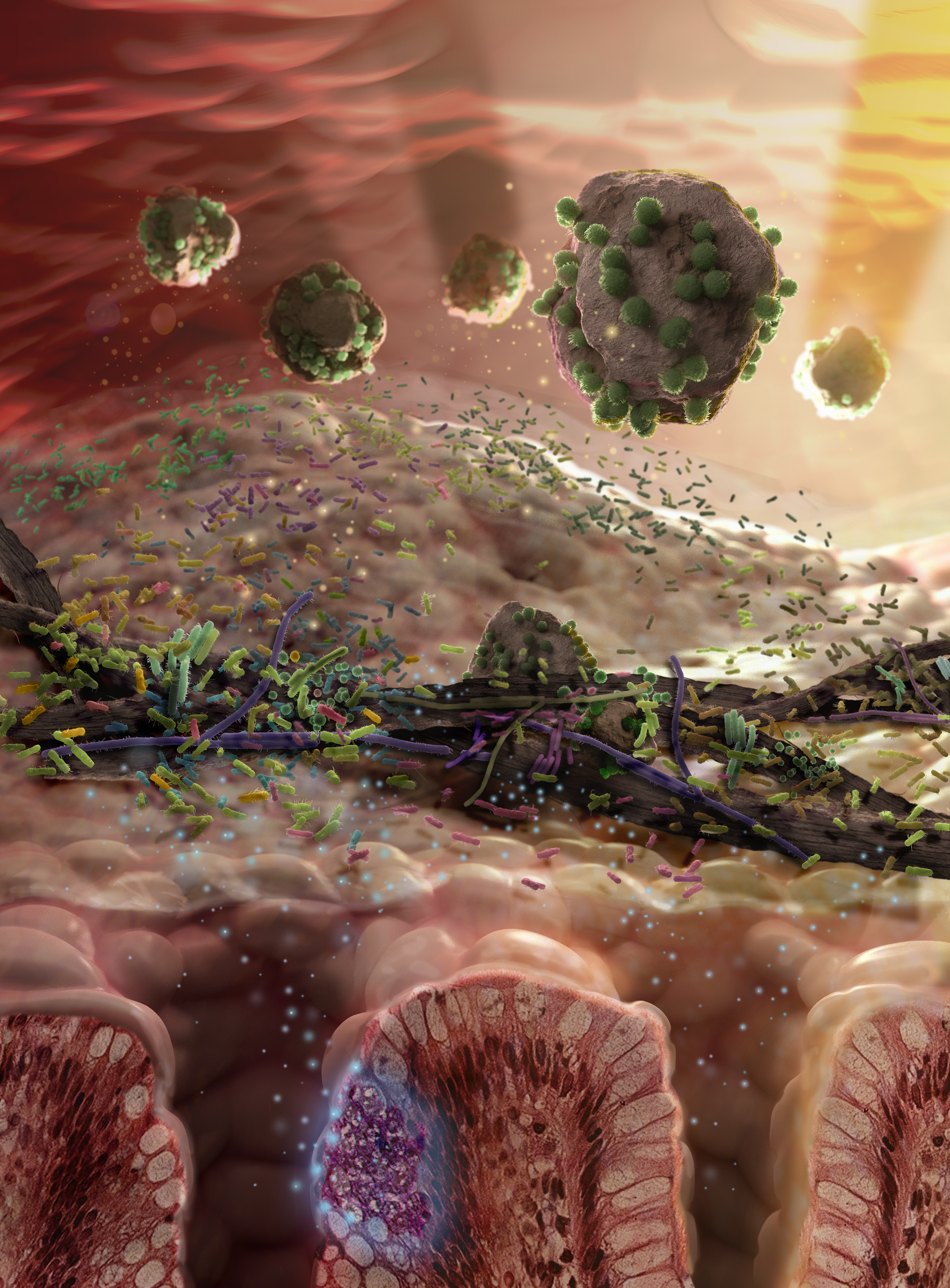
Scientific illustration of gut bacteria
Hungry microbiome. Image by Christian Stolte and Christopher Hammang
Biological illustration has come on a bit from the days of Gould’s gorgeous illustrations of birds, or Leonardo’s Vitruvian Man. Today, with the help of big data and big graphics power, we can visualise things, not just at the molecular level, but at work.
But why – apart from because it’s beautiful and fascinating – do we do it? How is it helpful? What can it show us?
Obviously, we’ve been using rudimentary data visualisation for a very long time. Charts, maps, tables, graphs. All data visualisations, but not at the level we now find ourselves working at. As Sean O’Donoghue, from our Digital Productivity and Services Flagship, puts it, ‘Data visualisation is a new visual language; we need to become fluent in it to manage the complexity of computational biology’.
Let’s think about genomic data. The more we know, the more we need new tools to deal with the knowledge we have. And we now know a lot. We’ve got the ability to generate tremendous amounts of genomic data from sequencing. Analysing that data is now the roadblock to our being able to convert what we’ve found into something useable.
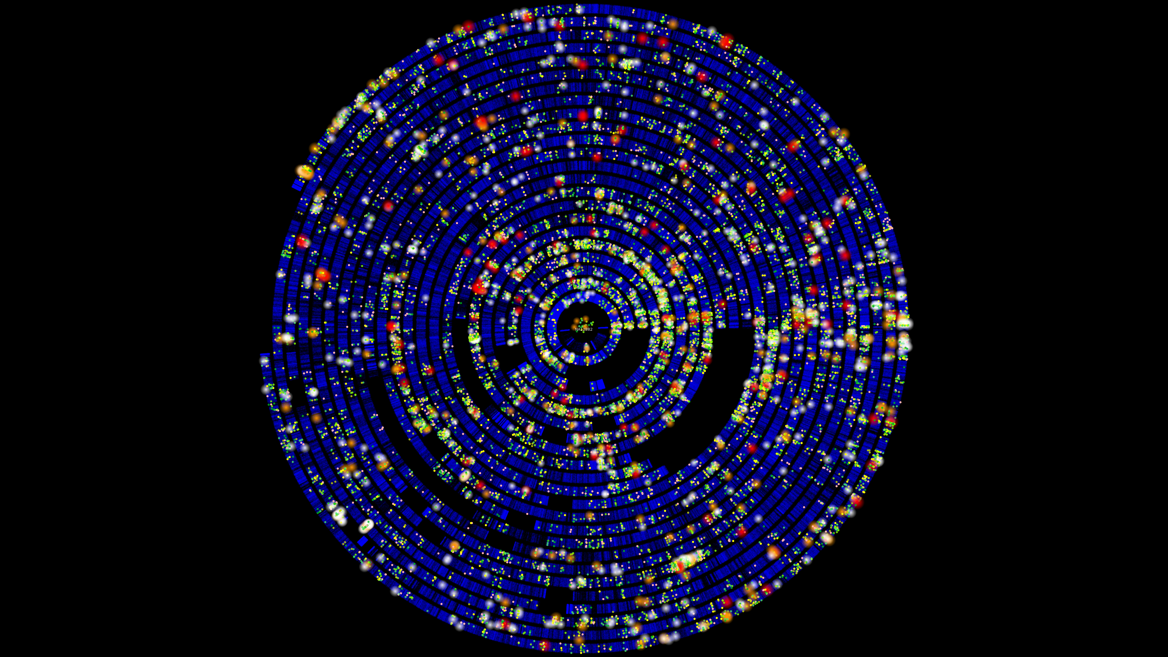
Data visualisation of a whole genome
Everybody’s uniqueness. Image by Beat Wolf, Pierre Kuonen and Thomas Dandekar
Obviously, some genome analysis can be done using automated processes. But that still leaves a lot that depends on human judgement, particularly in the early stages such as hypothesis formation. Our concentration – and eyes – frankly aren’t up to spotting something different in a field of As, Cs, Gs and Ts (and nothing else), that seems to go on forever. Think of Where’s Wally?, in monochrome, with one Wally hidden on a single page hundreds of times larger than book pages. And then imagine that finding the Wally you’re looking for could make a big difference to people’s lives.
If we can combine visual and automated analysis, the pairing becomes more powerful. Users can seamlessly look at their data and perform computations on it, refining their analysis with each step.
Visualising also helps us reason about complex data. Sometimes, a well-chosen visualisation can make the solution to a complex problem immediately obvious. That’s because of the way that visual representations simultaneously engage the eyes and the memory. When we look at a visual, our eyes and our brain work in parallel to take in new information, and break it into small chunks. Then both the eyes and the brain process the bits in their different ways to extract meaning. It works like this.
You’ve gone to the supermarket – not your usual one – to buy bananas. When you walk in, your eyes scan the layout. At the same time, your brain is processing the various sections of the layout, and telling your eyes to home in on the fruit and veg section. It does this by sending signals from memory about how fruits look. Your eyes then break the entire scanned area into parts, then scan each part until they (all but instantly) recognise the veggie section. The same process is repeated until you spot the bananas in the fruits section. Your eyes and memory do their own things but work in parallel.
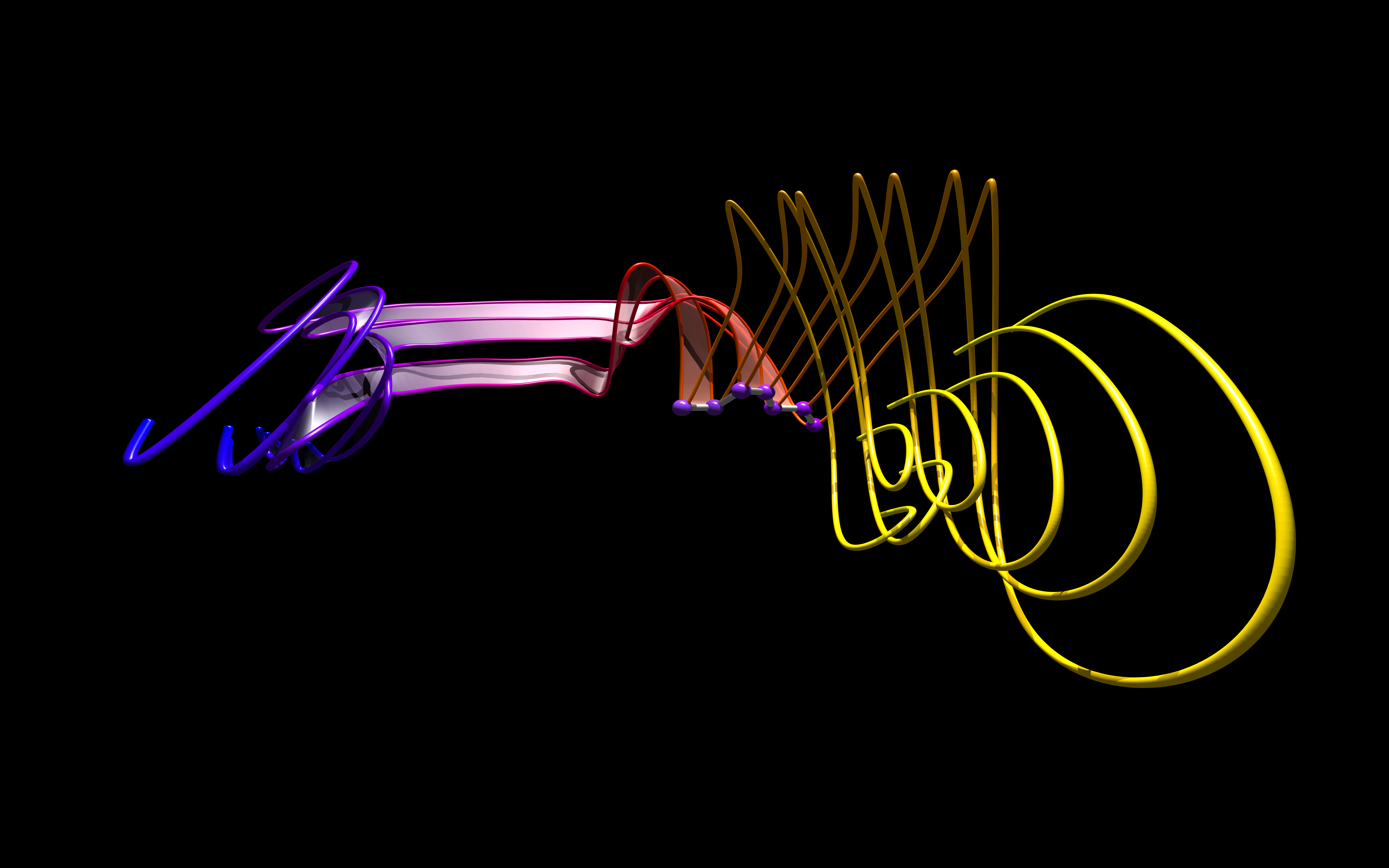
Data visualisation of protein folding
‘Folding beauty’ Image by Shareef Dabdoub and William Ray
We’ve used our brains to build tools that can help us discover more and more. But making sense of what they’ve found still depends on us and our limitations. Around half of the human brain is devoted – directly or indirectly – to vision. Visualising the vast streams of data lets us work with what we’ve got to make it something more than a hunt for a tiny needle in a monstrous haystack.
If you want to see more data visualisations, there are some beautiful ones at Vizbi.