Every Boxing Day, hundreds of sailors set off in the famous Rolex Sydney Hobart Yacht Race. But how can science provide a winning edge?
To win the race, sailors must optimise their path taking the winds and the East Australian Current (EAC) into account. Back in the day, sailors used a thermometer in a bucket to find the currents. Now sailors have detailed datasets at their fingertips.
Our scientists contribute to key datasets that are critical toolkits for racing sailors.
Ocean conditions between Sydney and Hobart
Modern ocean navigation is often less about avoiding the rocks and more to do with forecasting the weather. A boat that finds favourable winds and ocean currents will sail faster than one that doesn’t.
Teams put enormous effort into seeking the best conditions possible.
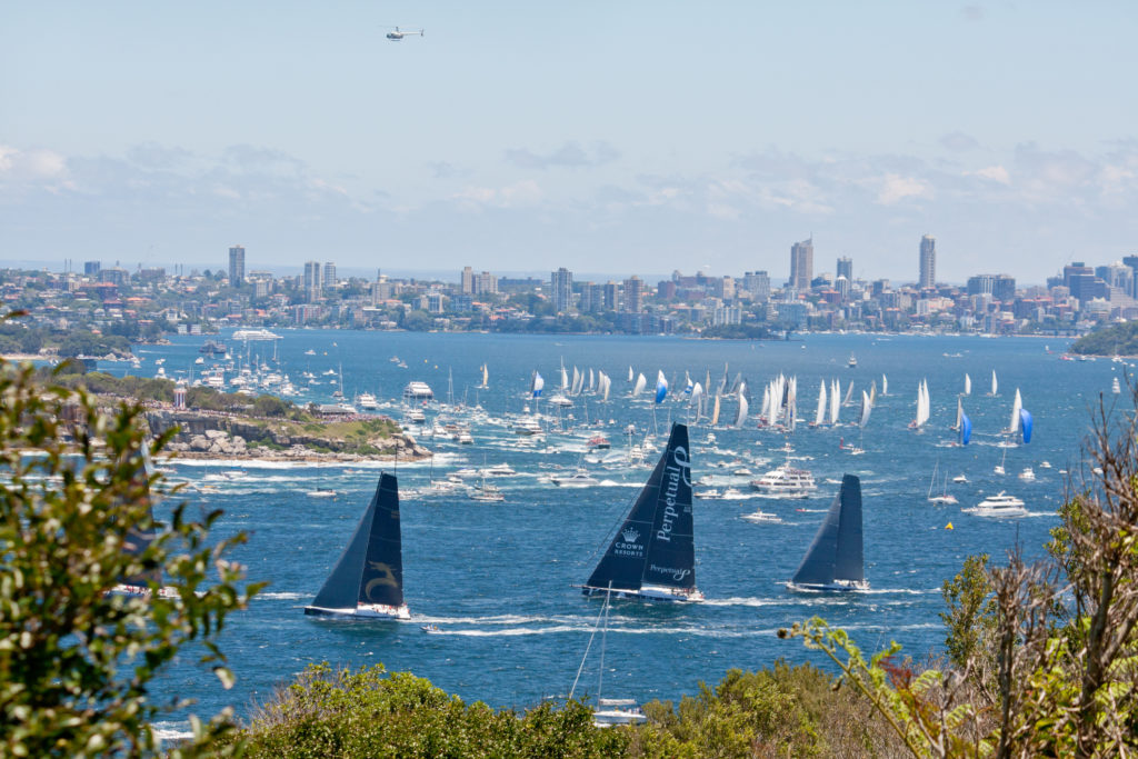
Sydney Harbour, Australia, 26 December 2013. Leading yachts sail through Sydney Harbour Heads at the start of the Sydney-Hobart yacht race.
The race course from Sydney to Hobart is along the extension of the EAC. The old racing trick was to sail southeast from Sydney and take the temperature of a bucket of seawater every hour or so. If the temperature suddenly increased, sailors knew they had reached the EAC and turned south. They’d aim to ride this current all the way to Hobart.
However, oceanographers know that the EAC between Sydney and Hobart is not a straight conveyor belt. It involves a chaotic eddy field.
Gaining speed in the current
Eddies are loops of current that often form near Sydney. They either re-join the EAC or separate entirely and move slowly southward towards Hobart. Sailors can use the favourable side of these rotating eddies to gain an extra one or two knots of boat speed (that is, they’ll get ahead an extra two to four kilometres every hour).
However, because the eddies are circular and often only 100km to 200km wide, the sailors need to steer a course to leave each eddy and find another one to continue along favourable currents.
This may or may not be worthwhile, considering the extra distance, and the speed and direction of forecast winds. Sailors who don’t take the ocean conditions into account may end up on the wrong side of an eddy and find themselves sailing against a northward flow. This slip up could mean sailors lose ground compared to competitors elsewhere.
Finding the best course using science
The optimal course is a skilful balance of present and future conditions along with the expected speed of the boat.
To find the present location of the eddies, sailors can use satellite information. Our scientists use satellite datasets to prepare images like the one below, as part of Australia’s Integrated Marine Observing System (IMOS) collaboration. These images show today’s temperature information over a much larger area than a thermometer in a bucket.
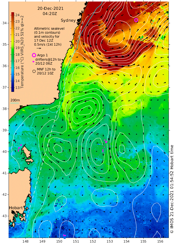
Sea level anomaly and sea surface temperature: two of the key datasets derived from satellites used to identify eddy fields. 20 December 2021. The dashed line shows the rhumb line between Sydney and Hobart. Prepared in a collaboration between IMOS and CSIRO. (Source: IMOS-OceanCurrent)
Savvy sailors can go one step further. They can consider the future wind and ocean conditions using output from numerical ocean forecasting models.
Ocean forecasts are provided by the Australian Bureau of Meteorology (BOM) using the Ocean Modelling Analysis and Prediction System (OceanMAPS). These are freely available on the BOM website. The forecasts are updated daily with a new analysis of available data and will differ from day to day.
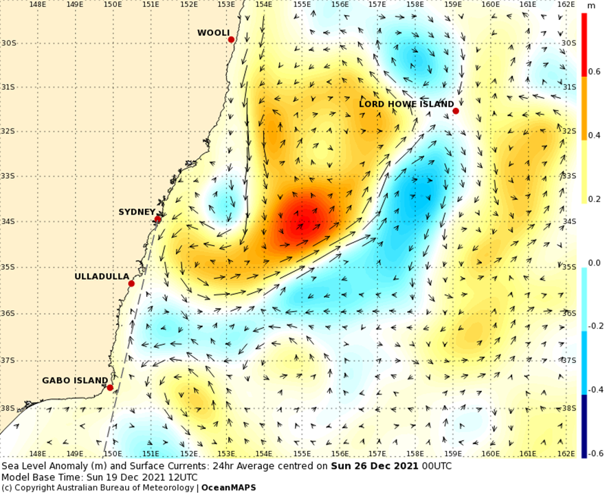
Sea level anomaly and associated currents from the OceanMAPS forecast model. Circular red features are warm-core eddies. The dashed line shows the rhumb line between Sydney and Hobart. (Source: BOM)
Ocean forecasts for sailors and for the Australian community
The science underpinning OceanMAPS is developed by the Bluelink partnership, which includes science teams from us and BOM. A key dataset arising from this science is the Bluelink ReANalysis (BRAN), which is led by our scientists. BRAN is the best estimate of daily global ocean conditions from 1993 until the present day and acts as a verifiable testbed for ocean forecasting systems.
The Bluelink partnership produces ocean forecasts and data that are widely used by the Australian community: mariners, researchers, fisheries, the Royal Australian Navy, and search and rescue authorities.
At this time of year, Bluelink ocean science also serves the navigators eyeing the Sydney to Hobart trophy.

25th December 2021 at 12:27 am
Science was never my best subject, but I enjoyed reading your explanations of the ocean mapping and its obvious contribution to the safety and the speed of the competitors.
24th December 2021 at 9:55 am
My father compete in the Queenscliff to Devenport yacht race on a small yacht called Anitra when I was young – probably the 70’s. My mother listened to the chatter over the shortwave on an enormous valve radio. I love the idea of taking a bucket of water and taking its temperature. Shows again how far Science has come since then. Well done CSIRO
23rd December 2021 at 12:44 pm
Wonderfully succinct explanation of complex systems. Well done