Our online tool brings together disparate information to help government deliver support to drought-affected areas that need it most.
The long stretch of dry weather is putting pressure on farmers and communities across the country. Plus climate and weather experts across the globe are predicting that droughts are going to become longer and more severe in some parts of the country.
The severity of the current drought has certainly got everyone thinking about what we can do to help our farmers. And while there is certainly no easy fix, at least we know it’s top of mind for some of our best and brightest tech-sperts from Data61.
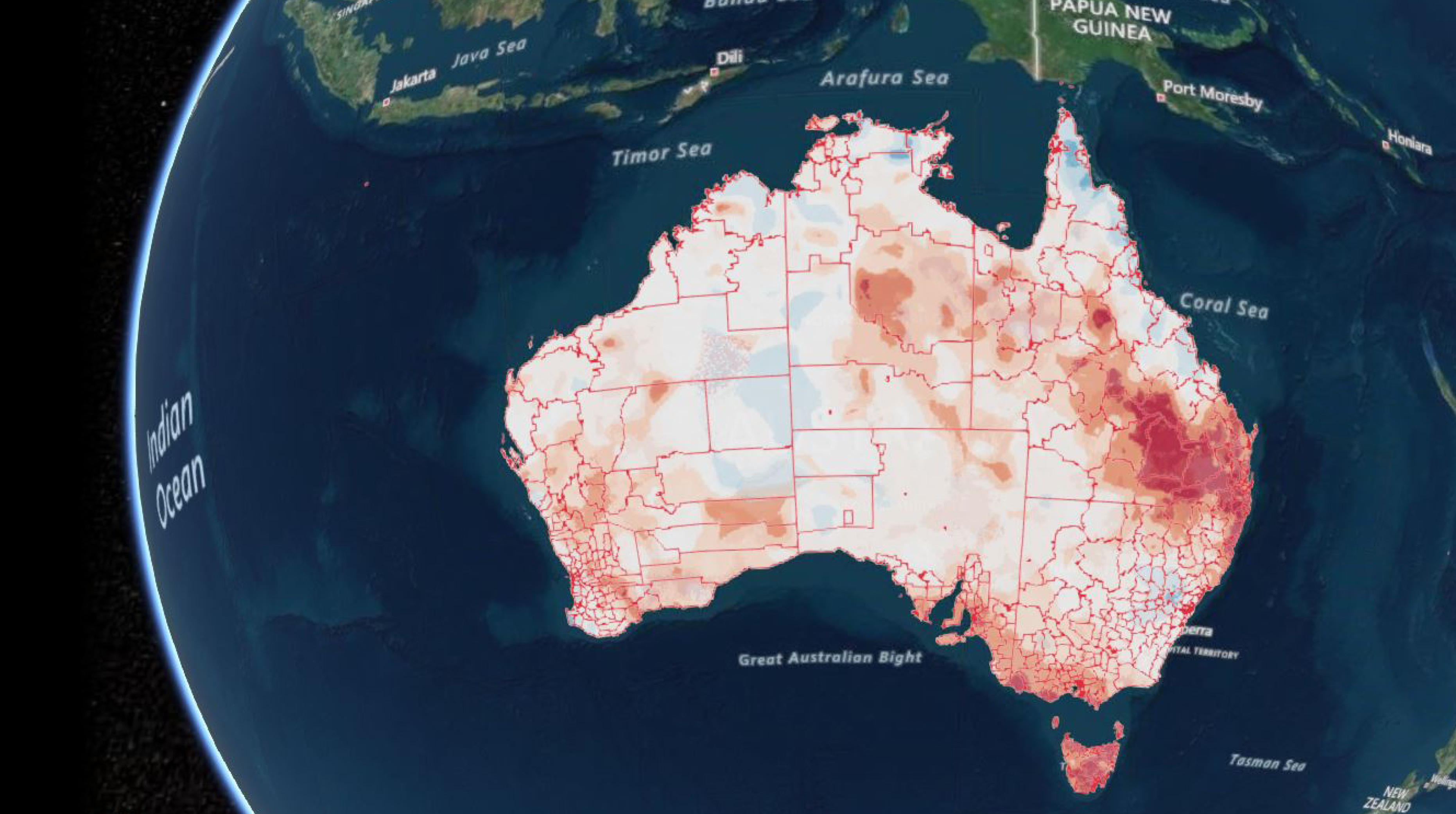
Part of addressing this challenge involves gathering and interpreting disparate pieces of data to provide a comprehensive picture of conditions and drought response across Australia. We’ve worked with the Joint Agency Drought Taskforce to apply our Terria interface to create the National Drought Map.
The National Drought Map is an online tool that brings together information on weather conditions, agricultural industries, state government drought declared areas and government drought support.
Information includes rainfall patterns, soil moisture, government assistance available, town size by population, numbers of farm businesses, agricultural types and employment by industries.
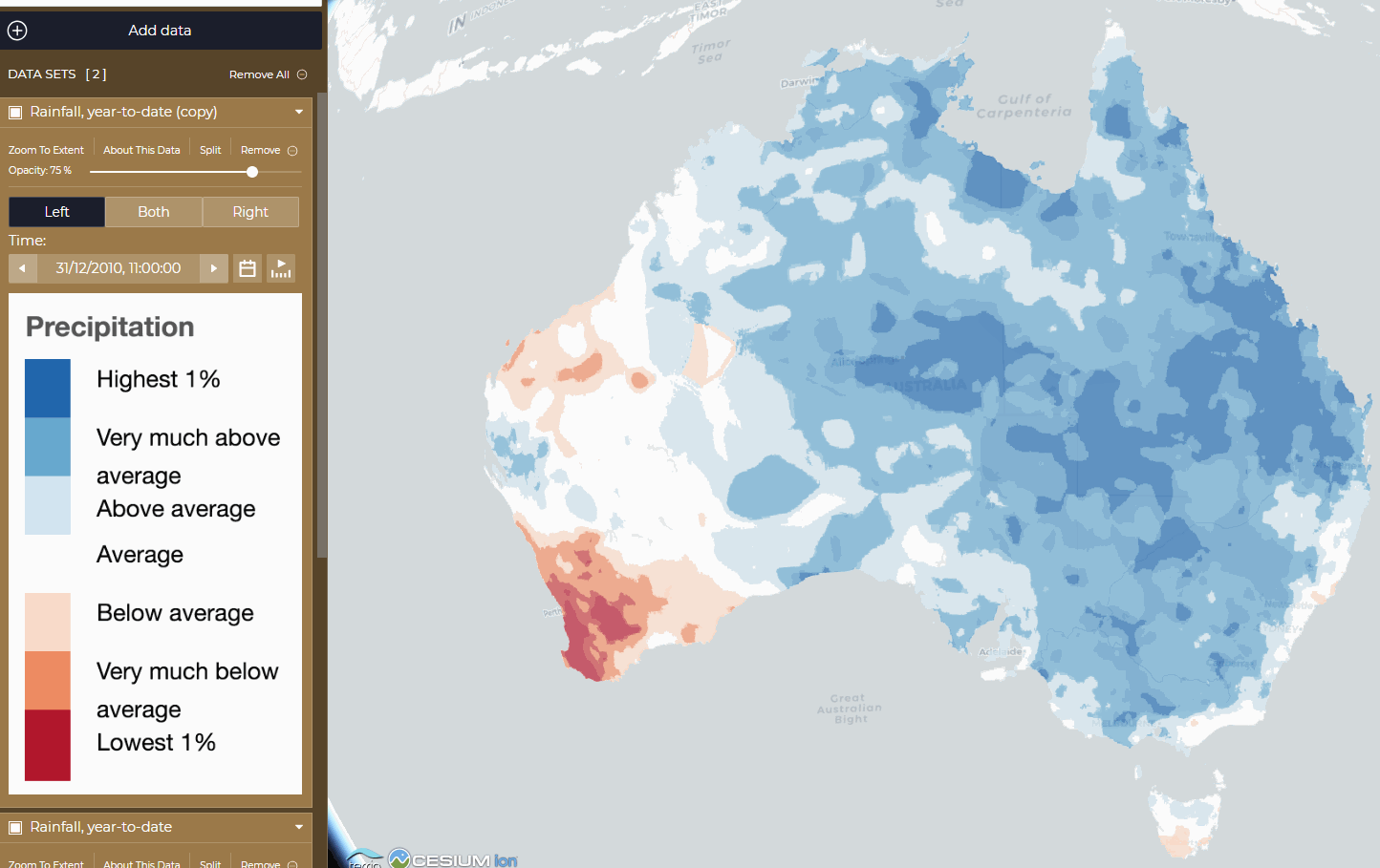
A comparison of 2010’s year-to-date rainfall (the left hand image) to 2018’s year-to-date rainfall (the right hand image), inside the platform
Launched on the 30th January 2019 by Minister for Agriculture and Water Resources David Littleproud, the National Drought Map will allow governments and other stakeholders to gain deeper insights into current drought conditions to determine where more support is needed. It also facilities coordination of response and provides information on the spread of drought using the latest meteorological information.
The value of the National Drought Map is the multiple ways data can be used to tell a story of what’s happening in a local area, which will assist with better decision-making.
For example, understanding the climatic, economic and social conditions in a regional community and quickly identifying the services they can access. With this knowledge, governments can direct information sessions and services, such as the Department of Human Services’ Mobile Service Centres, where they are most needed.

11th January 2020 at 11:32 am
I support anything that gives us a credible understanding of our environment and climate challenges. I want evidence based, quality information that is not influenced by any “agenda”. We need a national approach to our climate challenges that specifically address water management and bushfire prevention (eg. Indigenous Fire Prevention) with a strategic plan developed and implemented. A bipartisan approach is required as we need consistency (that is beyond politics) in our management of our continually changing climate challenges.
10th January 2020 at 9:05 pm
What timeline are you using for the average?
4th February 2020 at 9:24 am
Hi Douglas, we spoke to our Data61 team and this was their response “We get that rainfall data directly from the Bureau of Meteorology, and so we can only tell you what they’ve told us. In this case, they haven’t given us the timeframe over which the average of taken. The best people to ask would be BoM’s Climate and Water division at environment@bom.gov.au.”
Thanks,
Georgia
Team CSIRO
3rd August 2019 at 8:12 pm
Where can we plant forests to cool our country and increase rainfall?
8th February 2019 at 9:59 pm
tell the farmers to stop clearing our land