The Cape Grim Baseline Air Pollution Station in Tasmania
Updated August 2020
As your national science agency, we get lots of questions each month about climate change and greenhouse gases (GHGs). Like ‘what’s the latest carbon dioxide count?’
Our researchers collect important data on greenhouse gases from our own monitoring station. That data gets published each month on our website. So, we’re well equipped to answer the question!
The data we collect includes current levels of atmospheric concentrations of GHGs like carbon dioxide (CO2), methane (CH4) and nitrous oxide (N2O). They’re used by researchers around the world, including ours, to help understand climate change and our world.
But you might not be following that page, and even if you’re not a researcher, it’s information you might like to know.
We are now publishing our CO2 observations in an even more accessible format. It’s on Twitter and you can follow them at #CapeGrimCO2update.
Keeping watch at Cape Grim
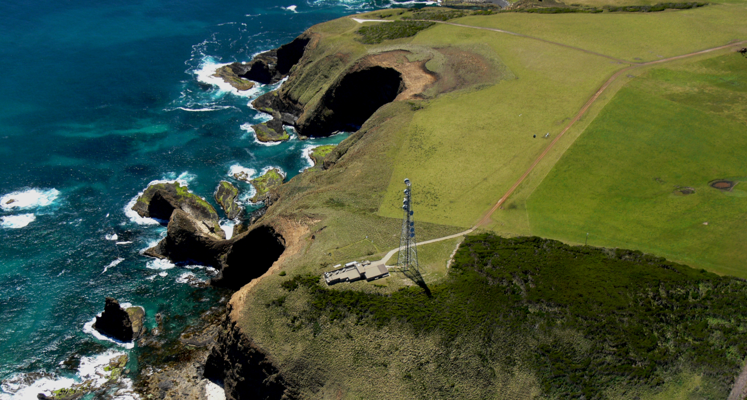
Hold up – where does this super important CO2 data come from? We capture the data at the Cape Grim Baseline Air Pollution Station in Tasmania. This location is bathed in some of the cleanest air in the world.
The Cape Grim station is just south of the isolated north-west tip (Woolnorth Point) of Tasmania. Amid the ‘roaring forties’, its location is as remote as it sounds.
Prevailing westerly winds frequently bring air masses that have travelled many thousands of kilometres across the Southern Ocean.
This means the ‘baseline air’ measured at Cape Grim has a composition representative of much of the Southern Hemisphere. And it’s as clean and free from recent human and terrestrial (natural) influences as anywhere on the planet.
That’s part of the reason the station is one of only three Premier Global Baseline Stations in the World Meteorological Organisation’s (WMO) Global Atmosphere Watch (GAW) program. And it’s the only one in the Southern Hemisphere. Together with Mauna Loa Observatory in Hawaii and Alert in the Canadian Arctic, these stations span the globe and monitor underlying global composition change.
CSIRO has been doing this at Cape Grim since 1976. Together with the Bureau of Meteorology.
Why is CO2 trending?
This is the part we’re keen to tell you about. Global average GHG concentrations have been trending upwards since the Industrial Revolution in the mid-18th century.
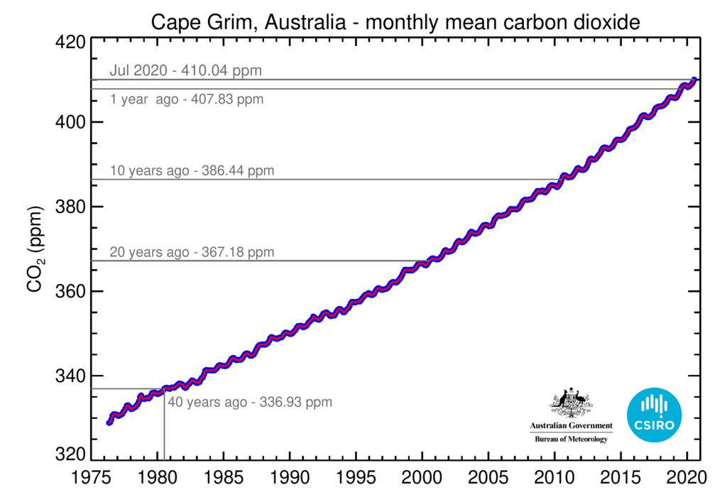
From our Antarctic ice core measurements, we know CO2 levels in the atmosphere were stable at around 278 parts per million (ppm) for millennia.
When measurements commenced at Cape Grim in 1976, CO2 concentrations had already risen to 328 ppm. They have been accelerating ever since, increasing by 25 per cent over the past four decades to reach 410.04 ppm in July 2020.
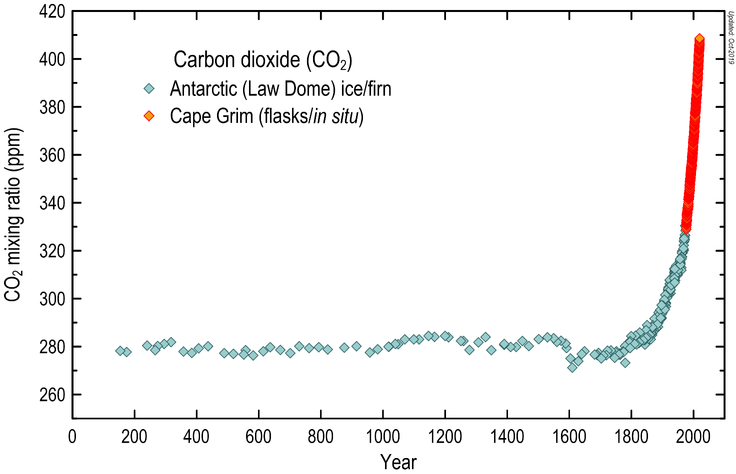
The atmospheric carbon dioxide concentrations (in ppm) over the last 2000 years, based on measurements of air trapped in Antarctic ice and firn (the compacted snow layer that eventually forms solid ice), shown in blue-grey diamonds, and the modern Cape Grim in situ record, shown in orange.
The measured increases in CO2 and other GHGs (such as CH4 and N2O) are predominantly caused by human activities. This includes fossil fuel use, land clearing and various agricultural practices which emit GHGs.
Our future climate depends on if, when and how rapidly the world manages to reduce GHG emissions.
What about those wiggles?
The long-term trend of rising CO2 concentrations tells the story of ever-increasing human GHG emissions.
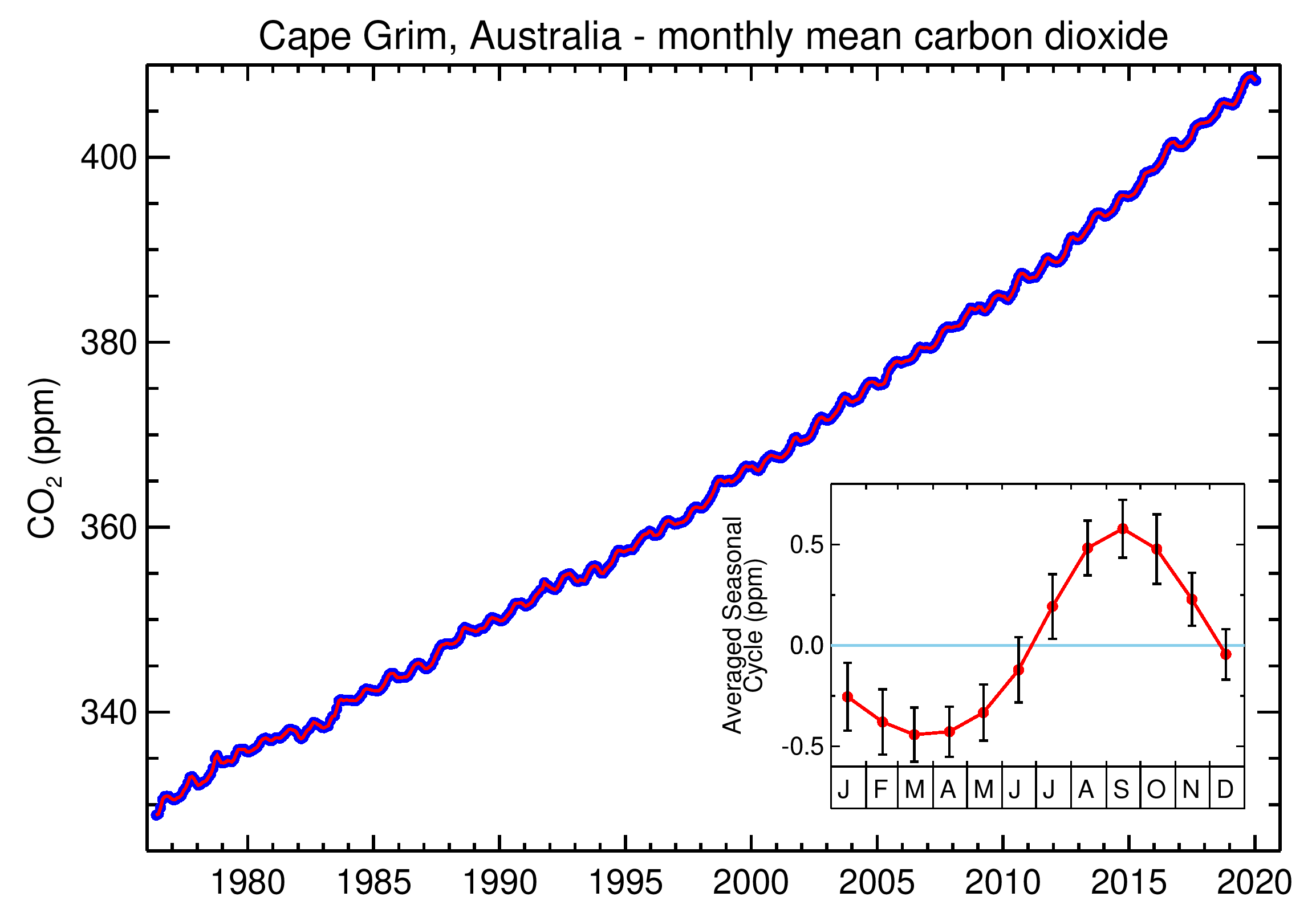
But you can also see gentle wiggles in the Cape Grim baseline CO2 record, with an amplitude of about 1 ppm. Those wiggles are the natural seasonal cycle. Plants take up CO2 through photosynthesis most strongly during the warmer, wetter parts of the year, beginning in spring and lowering the average CO2.
After summer, when conditions tend to be drier and cooler, ecosystem respiration dominates, releasing CO2 back into the atmosphere.
So, the wiggles are a seasonal cycle, but the overall trend is relentlessly upwards.
Has COVID-19 impacted on the amount of atmospheric CO2?
We’ve been getting lots of questions around the impact of reduced emissions during the COVID-19 shutdown.
Current estimates put the annual reduction of global fossil fuel CO2 emissions in 2020 at between 4.2% to 7.5% when compared to 2019. So yes, COVID-19 will impact the amount of CO2 in the atmosphere. Unfortunately, this does not mean that the amount of CO2 in the atmosphere will decrease. In fact, we expect CO2 to continue accumulating, but at a slightly slower rate than if there had been no pandemic.
Here’s the long answer
For the last decade or more, atmospheric CO2 has risen by 2-3 ppm each year. That variability in growth rate (~1 ppm/year) is due to variability in the natural carbon cycle that takes about half of all human CO2 emissions, so they don’t end up in the atmosphere.
The effect of the COVID-19 economic shutdown is expected to reduce this year’s increase by around 0.2 ppm from what it would have been in the absence of the global pandemic. But this will be very difficult to distinguish from the underlying natural variability in growth rate of ~1 ppm.
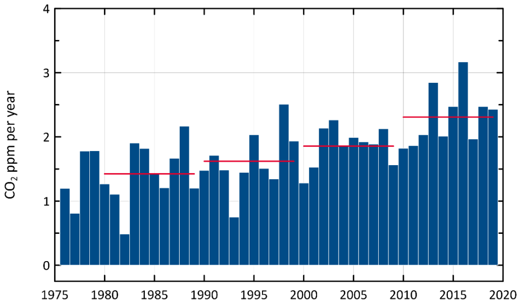
Mean annual growth rate of CO2 in ppm per year, measured at Cape Grim since 1976. Red horizontal bars show the decadal mean growth rate.
The above plot shows the accelerating rise of atmospheric CO2 in the last few decades. The step changes in CO2 growth rate each decade (red horizontal bars) in the graph illustrate that. It is rising because of escalating demand for carbon intensive energy and transport by a growing global population, as well as land clearing across the planet.
It will take a long time to understand the full impact on the baseline record at Cape Grim. Most of the emissions reductions from the shutdown were in the Northern Hemisphere and it takes many months for this air to mix into the Southern Hemisphere and appear at Cape Grim. By the time the air reaches the Cape Grim station, the impact of short-term changes due to the COVID-19 shutdowns will have been diluted considerably. As our scientists scrutinise the data, we will need to account for all natural and human-driven fluxes of CO2 into and out of the atmosphere, draw on carbon cycle modelling and apply robust statistics to interpret the data.
Breathe easy – we’re helping to tackle climate change
Cape Grim CO2 data are available from major global data archives. These data are already serving a vital purpose in climate research. They are widely cited in international assessments of climate change. And this includes reports by the World Meteorological Organization and the United Nations.
We also incorporate these data into our own climate and weather models. These models equip decision-makers with tools to navigate future climate impact and adaptation.
Follow the latest updates
To track the latest CO2 measurements, head to @CSIRO on Twitter and follow #CapeGrimCO2update. Or you can bookmark the page on our website.
We continue to publish the latest CO2 data on our website midway through each month. This is after we’ve completed our regular analysis from our baseline monitoring station at Cape Grim. Our monthly update includes the previous month’s data as a comparison point, as well as historic carbon dioxide levels dating back to the ‘70s.
Here’s what our monthly tweet looks like. If you have any suggestions about what you’d like to see, we’re keen to hear your thoughts.

19th March 2020 at 1:23 pm
For a further breakdown see the graphs produced by NASA, and you can even download the data – https://www.bloomberg.com/graphics/2015-whats-warming-the-world/?fbclid=IwAR1ZLPRxJQmFr8YNTaSBpjNtcVl24y8pi-pb9KK2CQJ8ueYNcbLa56HtSJg
19th March 2020 at 12:30 pm
50 years is a blink in the climate history. There were periods when the co2 was much much higher without the planet heating. Some say its good that c02 is increasing as it will enhance vegetation and crops. We also need to worry about H2O vapour and cow farts. And dont mentionthe sun’ variations and Earths wobbly orbit. And lets not talk about the models that climatologists cant agree on. Man made CO2 is such a small part of the equation.
6th March 2020 at 11:46 am
All of it. Humans do not create co2 and if they did it’s of no consequence. This is the common argument. But you have to google any results, and if you can’t find them you are not trying hard enough.
Perhaps csiro could provide an argument rebuttal to the above?
27th August 2020 at 10:06 am
Hi James, apologies but we’re not sure on the question you are asking. However, we encourage you to read the latest research on Australia’s climate and how it is changing at: https://www.csiro.au/en/Showcase/state-of-the-climate Thanks, Team CSIRO.
1st March 2020 at 6:40 pm
Very interesting BUT can you separate out CO2 frim warming oceans and bush fires and volcanoes? Seems strange that these are not reflected in the graph. ALSO is there any solid measured scientific data and facts that PROVE CO2 levels are related to or cause global warming, if there is any of that?
27th August 2020 at 10:07 am
Hi Don, we unpack the latest CO2 observations and questions around the Australian bushfires and COVID-19 at our latest blog: https://blog.csiro.au/carbon-dioxide-levels-over-australia-rose-even-after-covid-19-forced-global-emissions-down-heres-why/.
Thanks,
Team CSIRO
29th February 2020 at 12:11 am
Which portions of these charts do deniers assign to natural climate fluctuations?